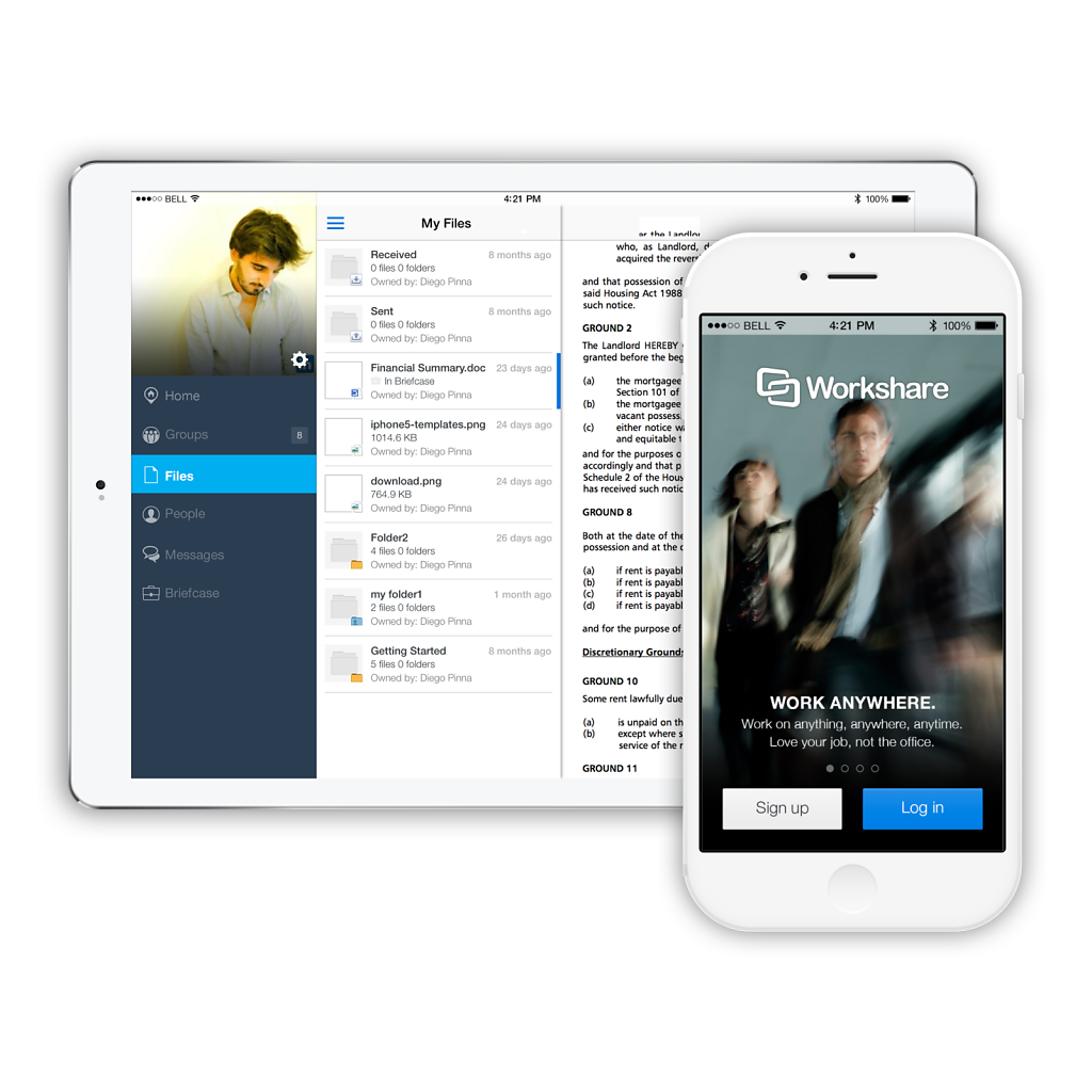
In 2012, Workshare launched an MVP mobile version of their Secure File Sharing web app. One year later, I was in charge of the redesign of the application. I started designing the iOS app and subsequently worked on the Android version.
Working with a Product Manager and a remote development team, establishing a constant and precise communication strategy was crucial to the project’s success. To this end, I produced interactive prototypes for each solution and feature I designed.
This strategy allowed me to verify user assumptions quickly and efficiently. Additionally, the prototypes ensured accurate communication of the final results to the team once the design of a UI or animation was complete.
Through this approach, we were able to work with stakeholders, developers and real users efficiently, since they could see and ‘touch’ the results of an iteration immediately after a series of feedbacks.
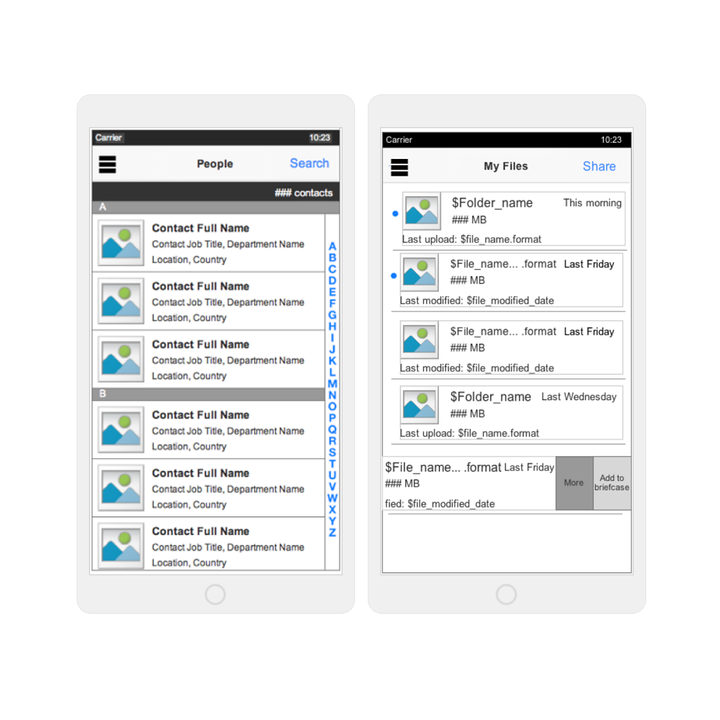
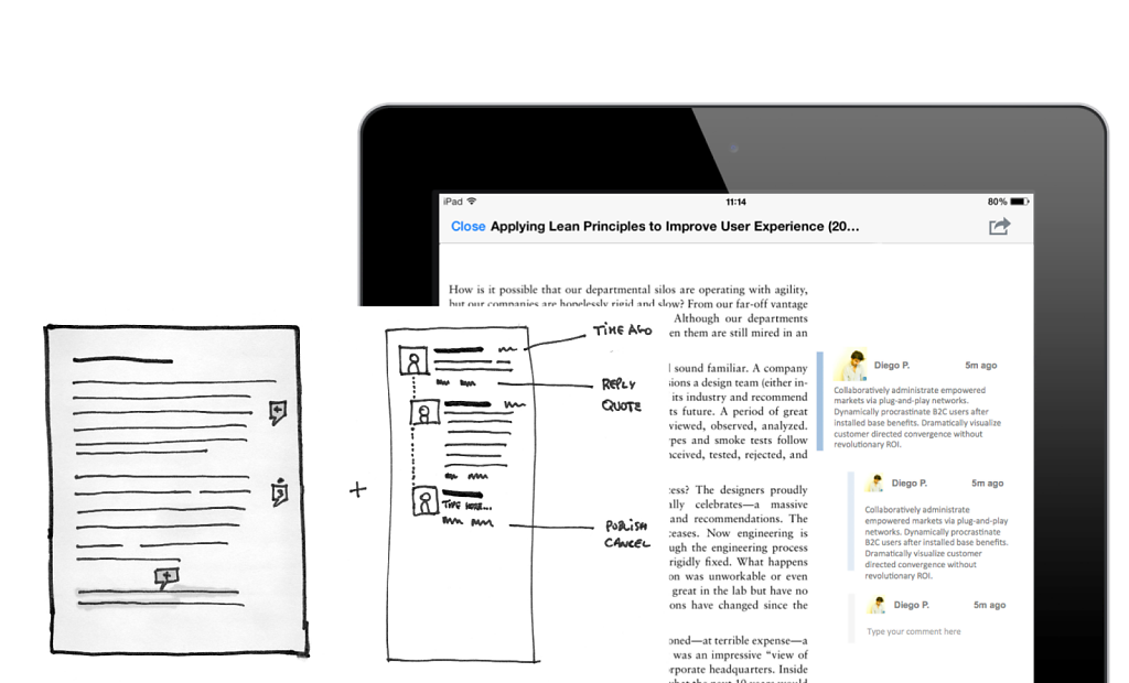
The prototypes were built following a practical approach: when a new feature was prioritized and assigned to design, I created some initial sketches to quickly capture and visualize ideas. Following a critique with fellow designers, product manager and developers, the best concept was selected. If needed this concept was digitalized in an interactive prototype. Once the solution was confirmed, annotated wireframes and UI designs were created. Finally, the designs underwent a final round of critique and demo to developers.
Wireframes documenting Contact and Document lists.
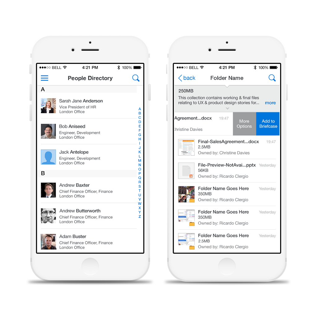
UI representation of the contact list and the documents included in a folder.
Steeleye is startup founded in January 2017 aiming to deliver an MVP to the market in a relatively short time frame. Steeleye intends to create a platform primarily for SMEs to satisfy MiFID II regulations, which will enter into effect in January 2018. The platform entails a communications and trades monitoring web-application and allows managers to initiate internal investigations, either when prompted by a regulatory authority, or for internal compliance.
I helped Steeleye’s team formulate the initial feature lineup and prioritize the design work. The primary actors in the platform are compliance managers that want proactively monitor their company’s trades & comms performance. It allows them to gather all existing data in a matter of minutes and generate a data report.
The design process required:
- interviewing internal stakeholders and domain experts, - identifying primary business objectives (BOs),
- creating multiple flows that would satisfy the BOs,
- lining up story maps and wireframes to mockup interactions,
- crafting visual designs for final signoff and handoff to developers.
Tools used during the project:
- Sketch - HTML/CSS/JS - Bootstrap - Keynote
Deliverables for this project:
- Wireframes - UI design - Zeplin UI export
Initial conceptual sketch.
User types - legal requirements define clearly responsibilities and roles.
Flow analysis with different end points.
A conceptual map helped the team visualise their requirements and point out the next steps, while providing a basic summary of the flow.
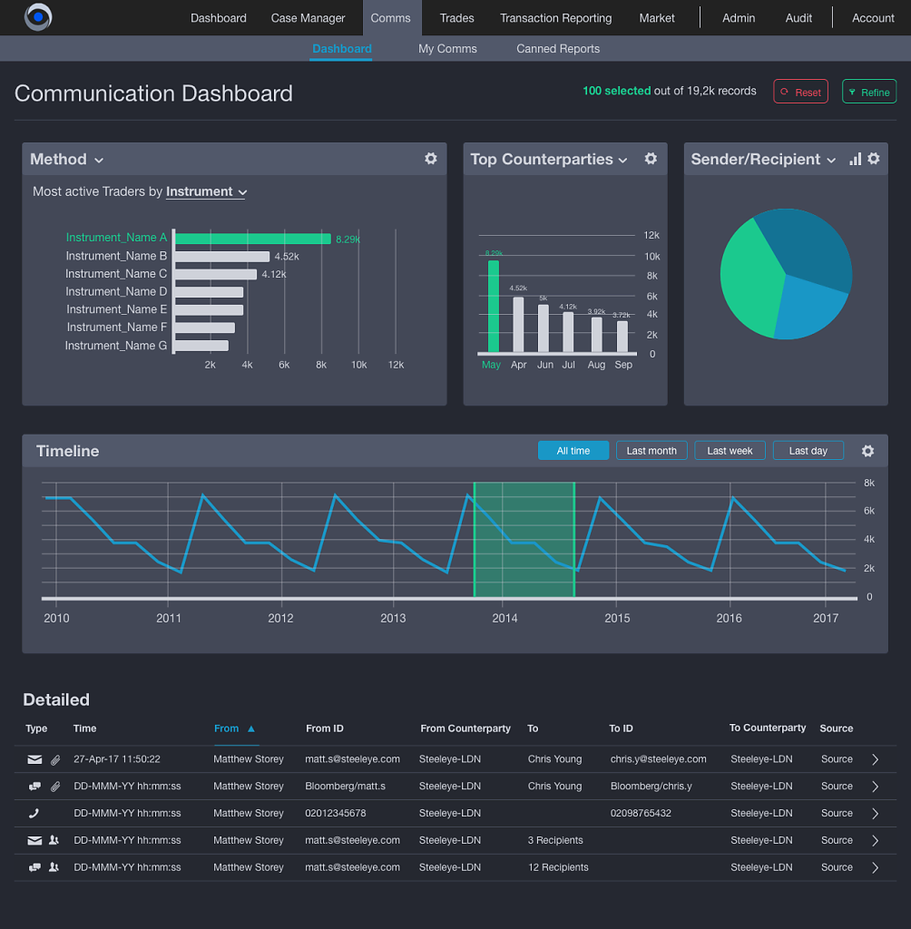
A high-level dash- board to provide a quick summary of the communication activity. A ‘nice to have’ feature to high- light the power of big data.
Certain pages allow users to compose data tables, based on their requirements. There are about 300 available headers.
The Communication dashboard is the main entry point for compliance manag- ers. Here, they can start filtering and exporting their inves- tigation’s communi- cation targets.
The HSBCnet Business Banking application project is an ongoing project with RMA Consulting that involves a significant design and development effort. The bank’s objective is to replace all the HSBC tools that each national entity created to satisfy their customers. HSBCnet will represent the online business banking tool for HSBC worldwide.
Tools used:
Pen & Paper
Axure
Keynote
Each feature I worked on had several stakeholders, product owners, business analysts, and had to satisfy different national regulations. This created an extremely challenging environment which compelled me to gather as much information as possible from each party before proposing improvements that would satisfy all of the legal and business requirements.
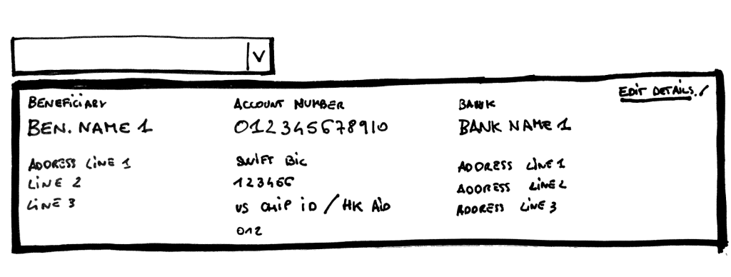
HSBCSketch for the payment beneficiary data panel redesign
To verify each improvement is a step in the right direction, I worked periodically with HSBC and set up prototypes for User Testing Interviews. I built interactive prototypes to test how they performed with experienced users, as well as to verify how new features are used and perceived by users. The prototypes were made to be high fidelity with a focus on micro-interactions, such as opening and closing of animations, or visualization of tips and error messages.
The “Payment Beneficiary management” feature represents a specific example of how customer requests helped the business prioritize different requirements. It also demonstrates that any solution had to respect several business guidelines and national regulations.
The “Preview rate” feature provides another example of a feature that needed a redesign. Users can request a real-time rate from the bank. The ordered price is available only for a short window of time. Understanding the main pain points for the user (e.g., need to read all the small prints before actually committing to the rate) allowed me to quickly improve the feature and solve a significant issue for the users active in the forex market.
Created the very first MVP of Clear Street’s Customer Portal, iterated to public launch in 2019. Set-up end-to-end design methodology (from requirements to user testing). Owned product definition engaging collaboratively with C-Suite stakeholders. Worked closely with marketing to launch rebranding and the public website to support scaling sales. Lead design team (one junior UX and one UI designer) and mentored developers.
Tools
Axure
AWS
Figma
Sketch
Additional info
This paragraph is supposed to define additional content for the image on the left/above.
Additional info part 2
This paragraph is supposed to define additional content for the image on the left/above. The second one!
Working with Golin's Digital Team dedicated to supporting Unilever, I worked onsite with the client team on two separate projects. The first tool, called CARA, is an internal product management tool. CARA helps Unilever staff to create new products and manage packaging copy for all Unilever brands (packaged food, beauty care, healthcare). I lead the initial design effort to summarize business needs and design requirements and allow the team to launch the first version of the MVP.
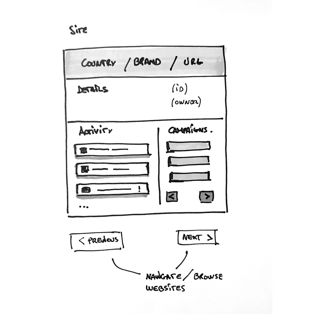
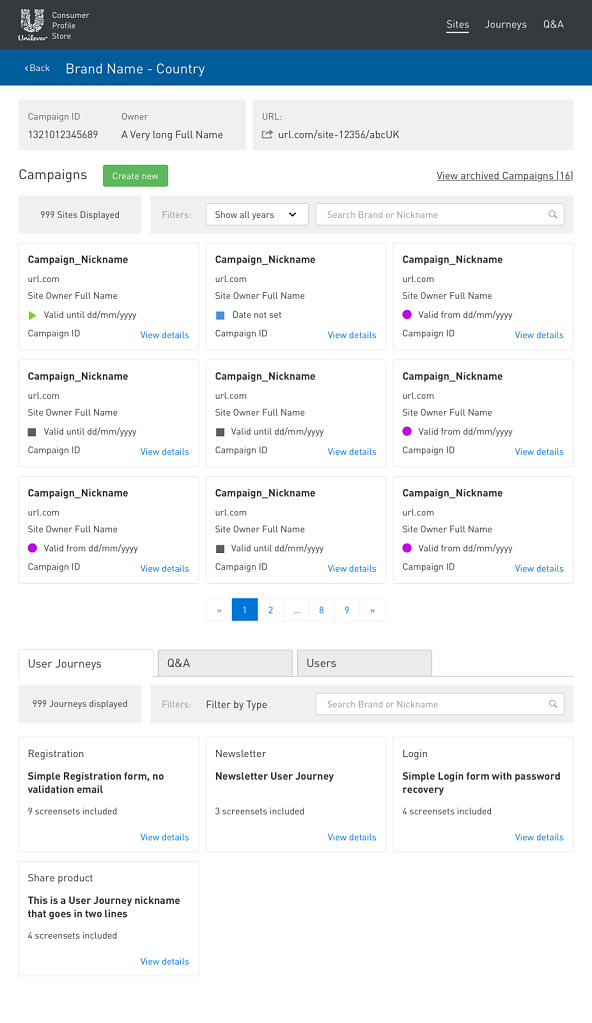
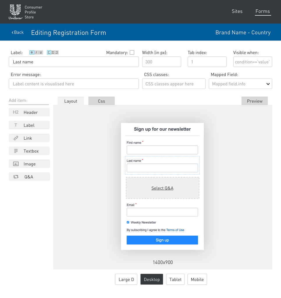
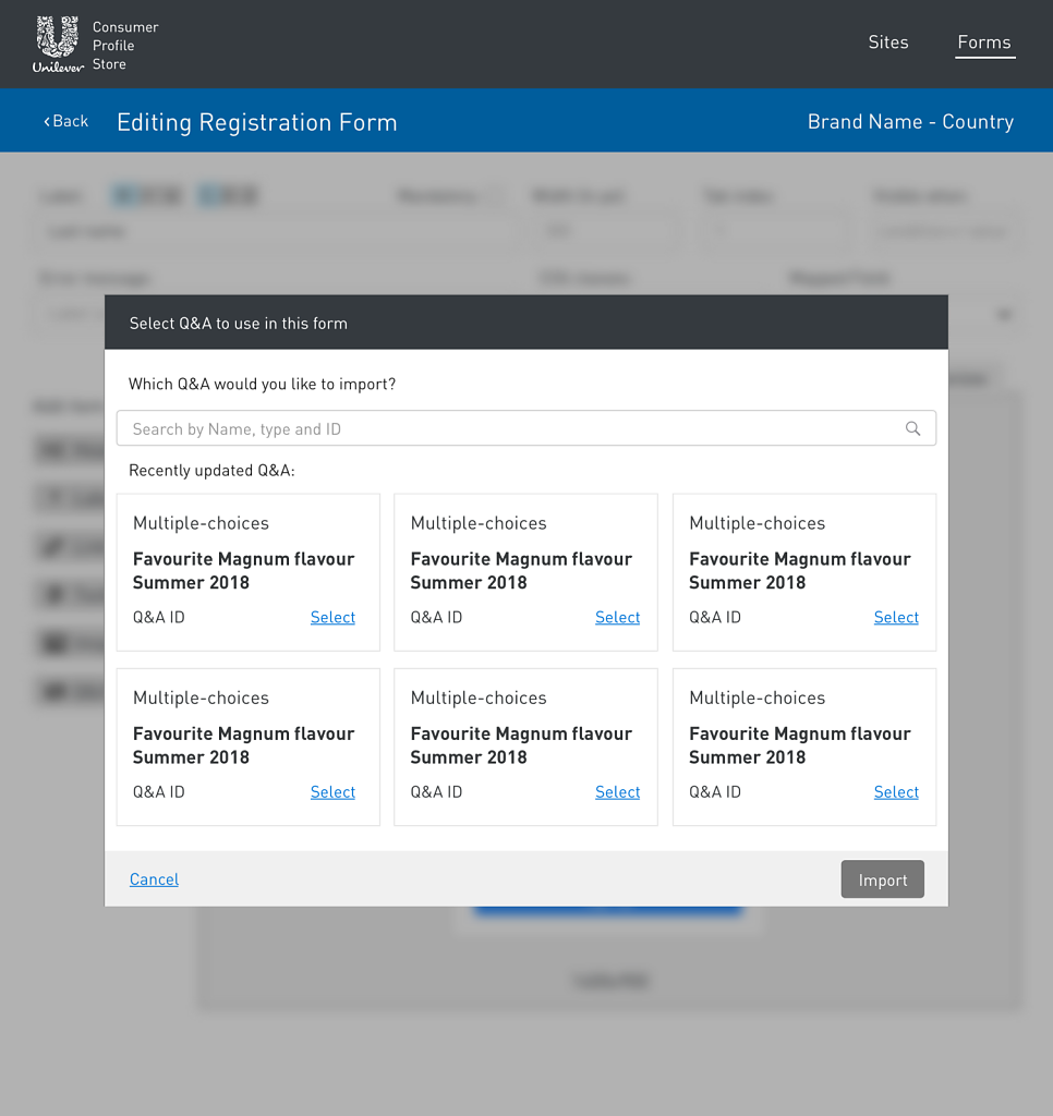
The second project was called Customer Profile Store (CPS). The CPS was a tool designed to integrate multiple third-party software into a single interface. This product is managed with complex user permissions to guarantee oversight over all Unilever brands at national and global levels. The marketing team used the CPS tool to provision new websites either for seasonal campaigns or for new product lines. Additionally, the marketing teams wanted the ability to manage analytics and tracking campaigns and to be able to create interactive forms. The forms' had to be published respecting the various privacy and data frameworks (e.g., California's Consumer Privacy Act, EU's GDPR, Chinese data management policies, etc.).
The new version of the CPS tool wanted to offer less functionality than the third-party software to reduce the amount of freedom (and potential mistakes) that a local brand team historically had. On a global level, Unilever's marketing team had the opportunity to introduce new brands into an existing market quickly. At the same time, they could maintain a coordinated messaging and respect the different privacy and data policies of all the countries in which Unilever operates. In 2018, Unilever was present in over 190 countries.
Analysis
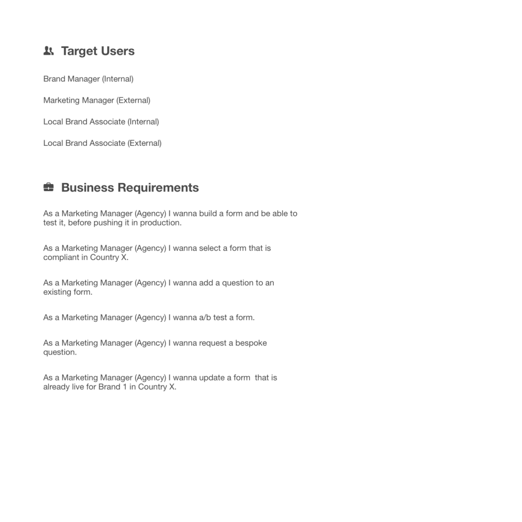
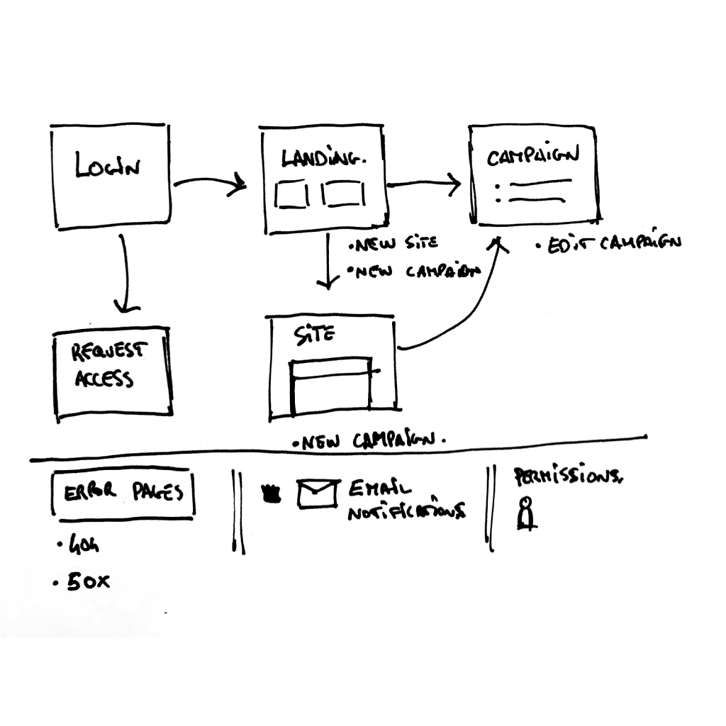
To provide clarity and support further design effort, I worked with the project's stakeholders and summarized the needs and users they wanted to support.
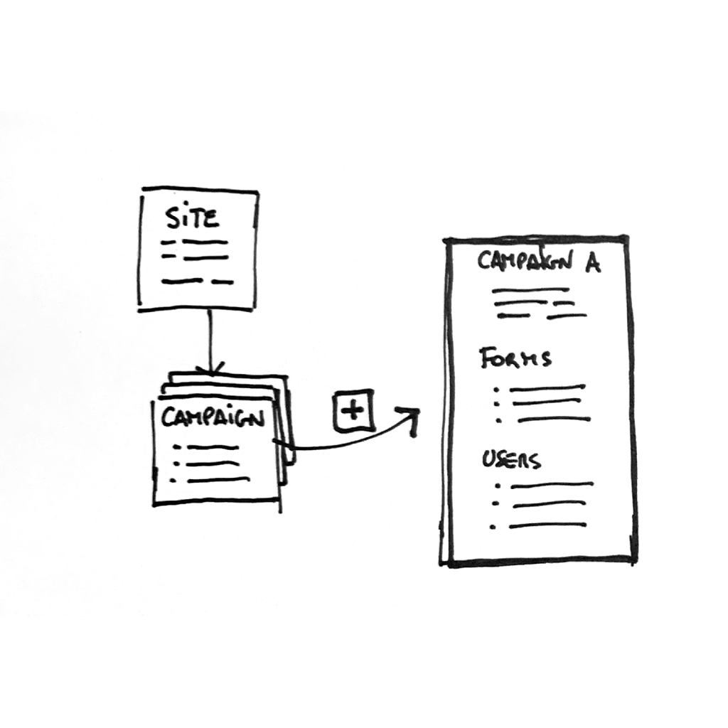
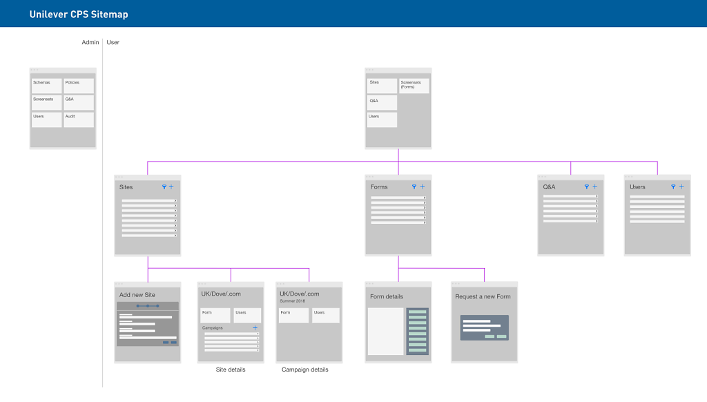
On that basis, I created a provisional sitemap used by the development team to estimate effort and scope. The first version of this tool was structured around the workflow that the stakeholders needed to impose on the local marketing teams. Third-party software's functionalities dictated several limitations (e.g., Gigya.com) and the flows they imposed to be correctly integrated.
Deliverables
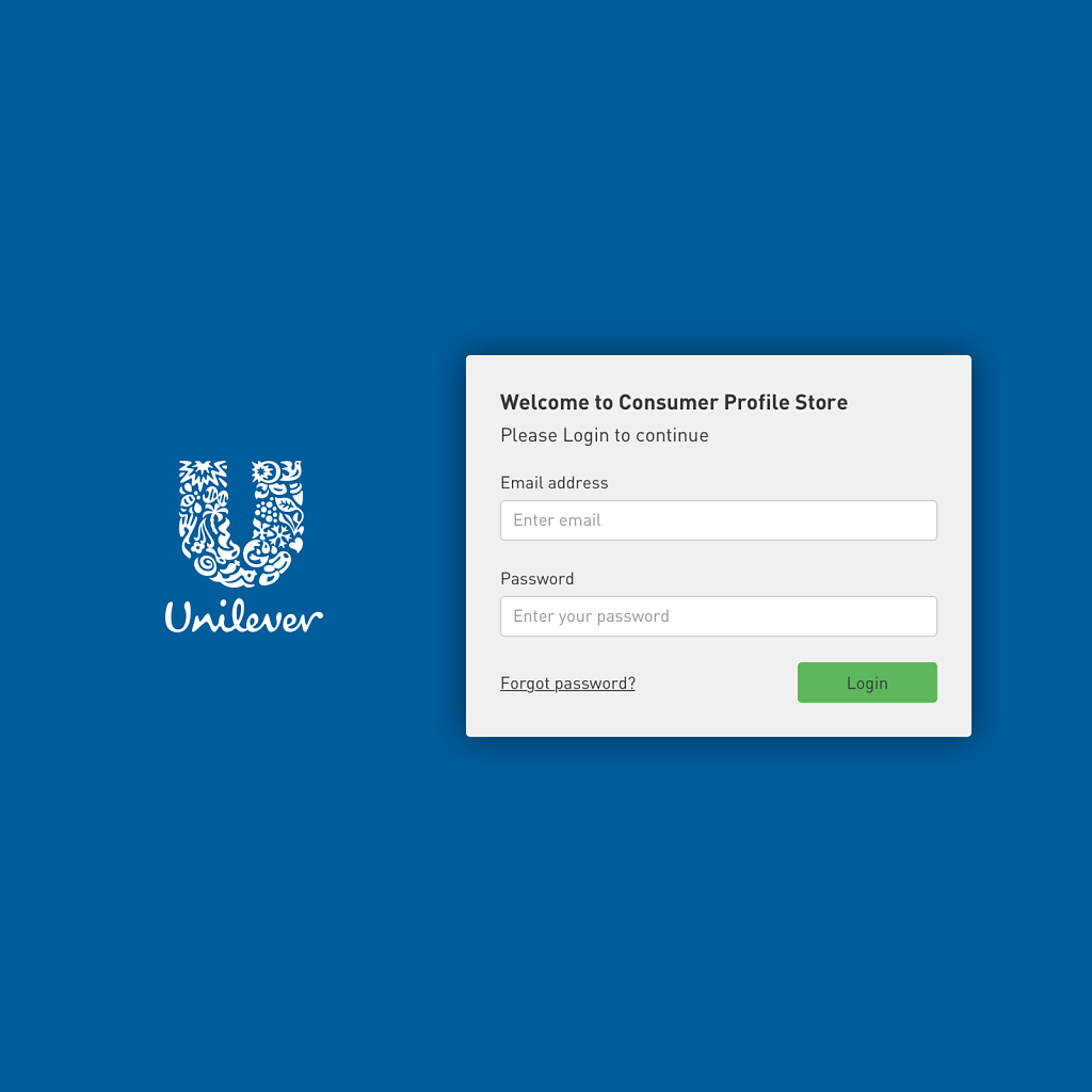
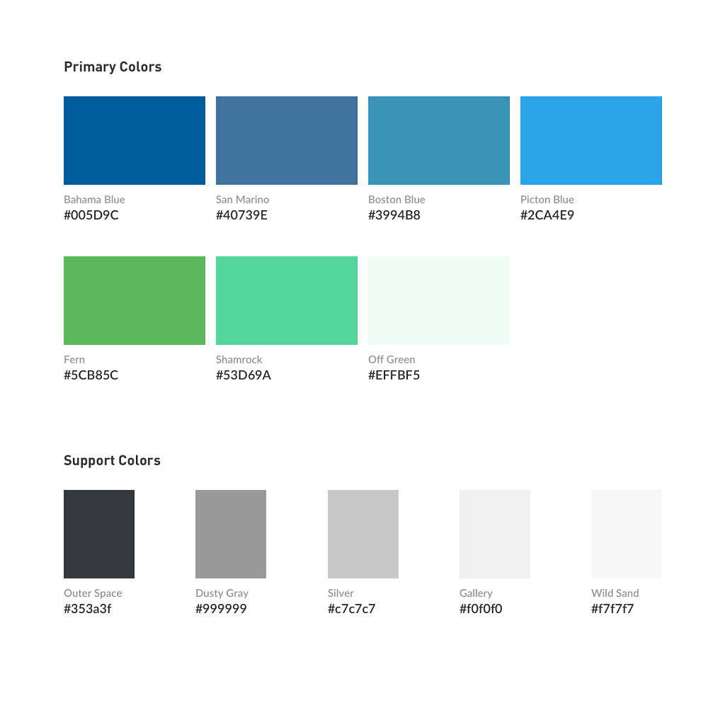
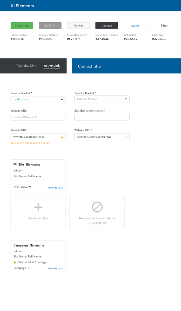
Leveraging Unilever's brand guide, I created a UI library that would be adopted for this tool. In parallel to this, I created mock-ups of the different views and functionalities. These were tested then on marketing team members and eventually rolled out by the end of 2018.
H-ART (www.h-art.com) was responsible for the re- design of the global Maserati website, updating the brand’s online presence and creating a universal image for the Italian automotive brand. This effort also required determining an overall strategy for redesigning all 61 national Maserati websites, focusing on local sales of the four current car models.
As the only UX designer working on the project, I was responsible for developing the design strategy. The client end objective was to communicate the feeling that would be experienced by owning and driving a Maserati car. The strategy that I formulated re-organised the information architecture and developed a new content strategy. I removed the information clutter amassed over the years in the current website, making it easier for users to navigate.
Personas identified for the global website
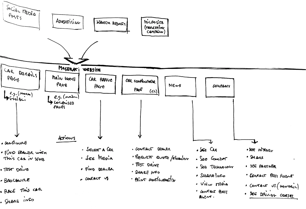
Each of the main themes of the website (i.e. car, company, and services) needed to be reachable and work as stand-alone entities. This would allow the brand to communicate with a single tone throughout the website, empowering users to explore Maserati without feeling lost.
Analysis of actions per page
To achieve this, I collaborated closely with the client and helped them formulate the key business requirements and the corresponding user flows. In the end, I presented the client with the UCD principles and agreed on a design roadmap, which allowed me to guide them in each of the design phases.
Stratagem is an early-stage startup that is in the market of forecasting sports results based on players’ performance data and seasonal variables. Their product offering includes Stratapro, a professional application, analyzing team performances. Based on users’ feedback on Stratapro, Stratagem decided to create a new product targeting casual sports fans.
The new application, Stratabet (stratabet.com), is more focused on betting than Stratapro, but it summarizes to a greater extent the data presented to users. Interested users could dig deeper and see detailed performance data, home and away results, and seasonal variations.
I joined the Stratagem team after an initial design was completed and underwent
user testing sessions. Thanks to this initial feedback, I could iterate and deliver design improvements to the responsive webapp. Once Stratagem went live in October 2017, I focus on ironing out lingering problems and inconsistencies in the platform.
Finally, I crafted a design library and provided guidelines for copy, components, and interactions.
- Introduced User Research and coached team to execute regular tests into our product development cycle; - Coach-Player structure to support expanding team needs; - Quarterly Design Demo to celebrate cross-functional design work.
Expanded the team hiring and onboarding two new designers.
Built an impactful collaborative environment with strong partnerships with cross-functional teams, setting a high bar for design craft, conceiving, defining, and driving design strategy.
Expanded user-centric design practice that focused on both a long-term vision and near-term goals.
Projects:
As an hands-on Design Manager, I continued working with the Nerdwallet Small Business Team (SMB) team to deliver design improvements and new features. Since 2021, I iterated on the original Fundera webapp and transformed it to support transaction tracking, cashflow evaluation, loan requests, and new verticals. Since Q1 2024, I started working on a new Paid experience to deliver curated content, video coaching and product discounts to help business owners to grow their activities.
I’m a product design leader with over a decade of experience transforming complex challenges into data-driven, user-centered products for global brands and startups.
At Point72, I design AI-powered platforms that help investment professionals uncover insights and test new strategies.
Previously, I led the SMB design team at NerdWallet, driving over $100M in annual revenue by uniting strategy, design, and execution.
I combine deep design craft with a data-driven experimentation mindset. Every project starts with clear hypotheses and clean instrumentation—product analytics, A/B testing, and user research working together to inform decisions. I'm hands-on with both the creative and analytical sides, leveraging AI tools to accelerate workflows while maintaining design quality. Beyond shipping features, I focus on building capable teams: mentoring designers on research methodologies, experimentation frameworks, and the discipline of measuring what matters.
Mission:
Since 2024, I have led the end-to-end design of a new AI-powered Intelligence & Surveillance platform for Point72, aimed at helping portfolio managers (PMs) and analysts discover hidden company connections, predict performance, and integrate AI insights directly into their investment research workflow.
As the sole designer on the project, I partnered closely with product, engineering, and data science teams to create a premium, trustworthy product experience designed for a high-stakes, data-driven audience. The platform is slated for full internal launch in 2025 and has already received strong qualitative feedback from early adopters.